


In a world where we switch between phones, tablets, and desktops without a second thought, your web application needs to keep up. A clunky, hard to use experience on any device is a surefire way to lose users.
If you’re building a SaaS product, client portal, internal tool, or marketplace, your app needs to work on mobile from day one.
It’s not just a technical buzzword; it’s the standard for creating web experiences that look and feel great everywhere.
This guide breaks down the core principles, the technical building blocks, the best practices , and how to build a mobile responsive web app with WeWeb.
What is a Mobile Responsive Web App?
A mobile responsive web app is a web application designed to automatically adapt its layout and functionality to fit any screen size.
The goal is to provide a seamless user experience whether someone is on a giant desktop monitor or a small smartphone. The application responds to the user’s environment using flexible grids, scalable images, and clever CSS rules.
The benefits are undeniable. Mobile friendly sites don’t just keep users happy, they drive results.
- Studies show that responsive layouts lead to about an 11% higher conversion rate on average.
- On the flip side, up to 73% of visitors will leave a site within seconds if it’s not mobile friendly.
- The business impact is direct, with 62% of companies reporting increased sales after switching to a responsive website design.
Essentially, a mobile responsive web app ensures your core features are always usable, just presented in a way that makes sense for the device at hand.
For example, a multi column dashboard on a desktop might elegantly stack into a single, scrollable column on a phone.
Foundational Strategies: Mobile First vs Desktop First
When you start designing a mobile responsive web app, you have to decide on your core strategy. Do you start with the big screen or the small one?
Mobile First Design
Mobile first is a design strategy where you begin by designing for the smallest screen (a mobile phone) and then progressively enhance the experience for larger screens.
This approach forces you to prioritize the most essential content and features from the very beginning.
This strategy became the gold standard for a reason. Global mobile web traffic overtook desktop for the first time in October 2016 and the gap has only widened since.
As of 2025, about 60.5% of all web traffic comes from mobile devices. Search engines have taken notice too. In 2018, Google officially rolled out mobile first indexing, meaning it primarily uses the mobile version of a website for indexing and ranking.
Starting with mobile ensures you are catering to the majority of your audience and aligning with search engine best practices.
Desktop First Design
Desktop first is the traditional method: design the full experience for a large desktop monitor first and then try to scale it down for smaller devices.
This was the default approach when desktop computers accounted for over 99% of web traffic back in 2009.
Today, this strategy often leads to a compromised mobile experience. It can be difficult to cram a feature rich desktop design onto a small screen without it feeling cluttered or broken. In fact, nearly 96% of users have run into websites on their phones that were clearly not optimized for mobile, a common result of a desktop first mindset.
While it might still be used for certain internal or enterprise applications where mobile use is minimal, it’s generally considered an outdated approach for the modern web.
The Building Blocks of a Mobile Responsive Web App
Creating a responsive experience relies on a set of core web technologies and techniques working together. These are the fundamental components you need to understand.
Setting the Stage: Viewport and Media Queries
First things first, you need to tell the browser how to behave on mobile.
- Viewport Meta Tag: This is a tiny but mighty line of HTML code:
<meta name="viewport" content="width=device-width, initial-scale=1.0">. It tells the mobile browser to set the page width to the device’s actual screen width and to load the page at a 100% zoom level. Without it, your responsive design won’t work, and mobile browsers will often show a zoomed out, tiny version of the desktop site. - Media Query: A media query is a CSS feature that lets you apply different styles based on the device’s characteristics, most commonly its width. For example, you can write a rule that says, “if the screen is 768 pixels wide or less, make the sidebar stack below the main content.” Media queries are the engine that powers most responsive layout changes and they became an official W3C Recommendation in 2012.
Structuring the Layout: Grids and Layouts
How you structure your page is critical for flexibility.
- Fluid Layout: This is a layout that uses relative units like percentages instead of fixed pixels. A container set to 90% width will always take up 90% of the screen, whether it’s a phone or a widescreen monitor. This prevents awkward horizontal scrolling or wasted space.
- Flexible Grid: A flexible grid system organizes content into columns that can resize and reflow. For example, a three column layout on a desktop might become a single column layout on mobile, with each block stacking vertically. Popular frameworks like Bootstrap are built on a flexible 12 column grid system.
- Flexbox Layout: Flexbox is a modern CSS layout module that makes it incredibly easy to align and distribute items within a container. It’s perfect for creating one dimensional layouts like navigation bars or rows of cards that can gracefully wrap onto new lines on smaller screens. Its powerful and simple syntax has made it a favorite among developers.
- CSS Grid Layout: While flexbox is great for one dimension (a row or a column), CSS Grid is designed for two dimensional layouts. It allows you to define a grid with both rows and columns simultaneously, giving you precise control over complex page structures. You can completely rearrange elements for different screen sizes just by changing a few CSS rules.
- Multicolumn Layout: This is a more specialized CSS feature that automatically flows text into multiple columns, much like a newspaper. It’s useful for making long articles more readable on wide screens, and it can automatically reduce the number of columns as the screen gets narrower.
Defining the Changes: Breakpoint Strategy
A breakpoint is a specific screen width at which your design’s layout changes. Your breakpoint strategy is your plan for where to set these points.
Some designers use breakpoints based on common device sizes (like for an iPhone or an iPad), but a more robust approach is to use content based breakpoints.
This means you adjust the layout at the point where your content starts to look bad or break. Frameworks like Bootstrap provide a set of default breakpoints that serve as a great starting point for any mobile responsive web app.
Responsive vs. Adaptive: What’s the Difference?
While often used interchangeably, responsive and adaptive design are different.
- A mobile responsive web app uses one fluid layout that adjusts to any screen size.
- An adaptive web application serves up several different fixed layouts, one for each specific device category (like mobile, tablet, and desktop). The server detects the device and sends the appropriate pre built layout.
Adaptive design can sometimes be more performant since you only load assets for that specific layout.
However, it requires significantly more development and maintenance, as you’re essentially managing multiple versions of your site. Because of its efficiency and flexibility, Google has long recommended responsive design for most websites.
Making Content Truly Responsive
A responsive layout is only half the battle. Your content, including images and text, needs to adapt as well.
Responsive Images for Speed and Clarity
Responsive images are about delivering the right sized image for the right device. You don’t want a mobile user on a slow connection to download a massive image designed for a 4K desktop display.
Using HTML attributes like srcset and the <picture> element, you can provide multiple image files and let the browser choose the most appropriate one based on screen size and resolution, or manage transformations and delivery via a Cloudinary integration.
This is crucial for performance, as images often make up the largest part of a page’s file size.
Responsive Typography and Readability
Text is the heart of most web applications. Responsive typography ensures it’s easy to read on every device. This involves:
- Using a readable font size: A base size of around 16px is recommended for body text on mobile.
- Controlling line length: Optimal readability is often cited as being between 50 and 75 characters per line. On wide screens, you should constrain the width of text blocks to prevent lines from becoming too long.
- Adjusting spacing: Line height and the space between paragraphs should be generous enough to avoid a cramped feeling, especially on small screens.
Sizing Content to the Viewport
This is a fundamental rule of responsive design: all of your content should fit within the screen’s width.
Users should never have to scroll horizontally to see something. This is a key criterion for Google’s mobile friendly test.
To achieve this, you need to avoid fixed width elements and ensure images and other media can scale down properly. Setting a CSS rule like img { max-width: 100%; height: auto; } is a common and effective technique.
Advanced Techniques and Best Practices
Once you’ve mastered the basics, you can refine your mobile responsive web app with more advanced methods.
Beyond Screen Size: Device Capability Media Queries
Modern CSS allows you to target more than just screen width. Device capability media queries let you adapt your design based on how the user is interacting with it. For example:
@media (pointer: coarse)targets touch devices, allowing you to create larger tap targets.@media (hover: none)targets devices that don’t have a hover state, so you can adjust interactive elements accordingly.@media (prefers-color-scheme: dark)lets you respect a user’s system preference for light or dark mode.
These queries help you create a more thoughtful and context aware user experience.
The Golden Rule: Avoid Hiding Content
In the early days of mobile, it was common to hide content on smaller screens to simplify the experience.
This is now considered bad practice. With Google’s mobile first indexing, the mobile version of your site is the primary one. If content is hidden, Google may not see it or may give it less weight, potentially hurting your SEO.
More importantly, it creates a frustrating experience for users who can’t access the same information on their phone as they can on a desktop. Almost 60% of users say they would not recommend a business with a poorly designed mobile site, and missing content is a major part of that.
How to Test Your Mobile Responsive Web App
You don’t need a room full of devices to test your work. Responsive testing in Chrome DevTools is an essential skill for any web creator. By pressing Ctrl+Shift+M (or Cmd+Shift+M on Mac), you can open the Device Toolbar. This powerful tool allows you to:
- Simulate various devices like iPhones, Pixels, and iPads.
- Enter any custom screen resolution.
- Toggle between portrait and landscape orientation.
- Simulate different network speeds to see how your app performs on a 3G connection.
- Emulate a less powerful CPU.
While it’s not a perfect replacement for testing on real hardware, Chrome DevTools provides a fast and convenient way to catch most responsive issues during development. Before launch, wire up event tracking via a Google Tag Manager integration to validate real-user behavior across breakpoints.
How to Build a Responsive Web App in WeWeb
Once you understand the principles behind responsive design, the fastest way to put them into practice is to build the app visually.
With WeWeb, you can create a responsive web app with AI, customize the layout in a visual editor, connect it to your data, and publish it without hand-coding every breakpoint.
Instead of starting from a blank CSS file, you can start from a prompt, a template, or a blank WeWeb project.
Start with AI or a responsive template
If you already know what you want to build, open WeWeb and describe the app in plain language.
Example prompt:
Create a mobile-responsive SaaS dashboard with a sidebar on desktop, bottom navigation on mobile, a metrics overview, a data table, user settings, and responsive spacing for tablet and phone screens.
WeWeb AI can generate the first version of your app, including pages, layouts, workflows, and data structure. From there, you can fine-tune everything visually instead of rewriting code.
If you prefer to start from an existing layout, browse WeWeb app templates.
Templates are useful when you want a proven starting point for common app types like dashboards, portals, directories, CRMs, forms, and internal tools.
If you want a full walkthrough, watch our step-by-step video tutorial on how to build an app with WeWeb. You’ll see how to go from an idea to a working web app using WeWeb’s visual builder, responsive layouts, and data connections:
Customize your desktop, tablet, and mobile layouts
A responsive web app usually needs more than simply shrinking the desktop version. Navigation, spacing, columns, tables, and forms often need to adapt by screen size.
In WeWeb’s visual builder, you can adjust layouts across desktop, tablet, and mobile breakpoints:
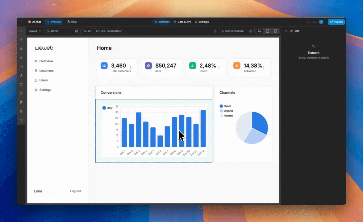
For example, you can turn a multi-column desktop layout into a single-column mobile layout, replace a desktop sidebar with mobile-friendly navigation, adjust padding and font sizes for smaller screens, hide or reorder elements for mobile users, and preview how each page behaves before publishing.
This makes it easier to apply responsive design best practices without manually writing queries for every layout change.
Frequently Asked Questions
What makes a web app mobile responsive?
A web app is mobile responsive if its layout and content automatically adapt to fit the screen size of the device it’s being viewed on. This is achieved using flexible grids, fluid layouts, and CSS media queries so that users get an optimal experience on phones, tablets, and desktops without needing to zoom or scroll horizontally.
Why is a mobile responsive web app important for SEO?
Since Google implemented mobile first indexing, it primarily uses the mobile version of a site for ranking. A mobile responsive web app ensures your site provides a good user experience on mobile, which is a major ranking factor. It also prevents issues like hidden content that could negatively impact how Google indexes your pages.
What is the difference between a mobile app and a mobile responsive web app?
A native mobile app is a program you download from an app store (like the Apple App Store or Google Play) and install directly onto your device. A mobile responsive web app is accessed through a web browser on your phone, just like any other website. It doesn’t require installation but is built to look and feel like a native app on mobile devices.
How do I make my existing web app responsive?
Making an existing app responsive typically involves a redesign of its frontend. This includes implementing a flexible grid system, replacing fixed width elements with relative units (like percentages), adding a viewport meta tag, and writing CSS media queries to adjust the layout at different breakpoints. For complex projects, this can be a significant undertaking, which is why many turn to platforms like WeWeb to rebuild with responsive principles from the ground up. If you prefer to learn by doing, follow step-by-step tutorials in the WeWeb Academy.
Is mobile first always the best approach?
For the vast majority of public facing websites and applications, mobile first is the recommended strategy. It aligns with user behavior (over 60% of web traffic is mobile) and SEO best practices. However, for some specific internal tools or complex enterprise software where usage is almost exclusively on desktop, a desktop first approach might still be considered.
Conclusion
Building a mobile responsive web app is no longer optional; it’s essential for reaching and retaining your audience.
By embracing core concepts like fluid grids, mobile first thinking, and responsive content, you can create experiences that are both functional and delightful, no matter the device. For inspiration, explore responsive apps built with WeWeb to see these patterns in production.
The journey from a fixed layout to a fully responsive one involves many moving parts, from the viewport tag to advanced CSS Grid layouts. Fortunately, you don’t have to navigate it alone.
Tools like WeWeb abstract away much of the technical complexity, empowering creators to build powerful, responsive applications visually.
By putting these principles into practice, you’ll be well on your way to creating web experiences that work for everyone, everywhere.
