
Most front-end design mistakes aren't about aesthetics. They're about structure: layouts that break at different screen sizes, inconsistent components, missing interaction states, or no design system.
Good front-end design creates interfaces that remain usable, consistent, and easy to maintain as your product grows.
Here are six front-end design principles every builder should know.
The Top 6 Front-End Design Principles
1. Understand the Fundamentals of Front-End Design
Front-end design is the process of shaping the interface people see and interact with in a website or web application. It combines visual design with the structure, layout, and behavior needed to make that interface work in the browser.
Every front end is built on three core web technologies:
- HTML provides the structure and hierarchy of the page.
- CSS controls layout, spacing, typography, colors, and presentation.
- JavaScript adds interactivity and dynamic behavior.
You don't need to write all three yourself to build a professional web application. But understanding a few of the concepts behind them makes it much easier to build layouts that behave predictably and troubleshoot them when they don't.
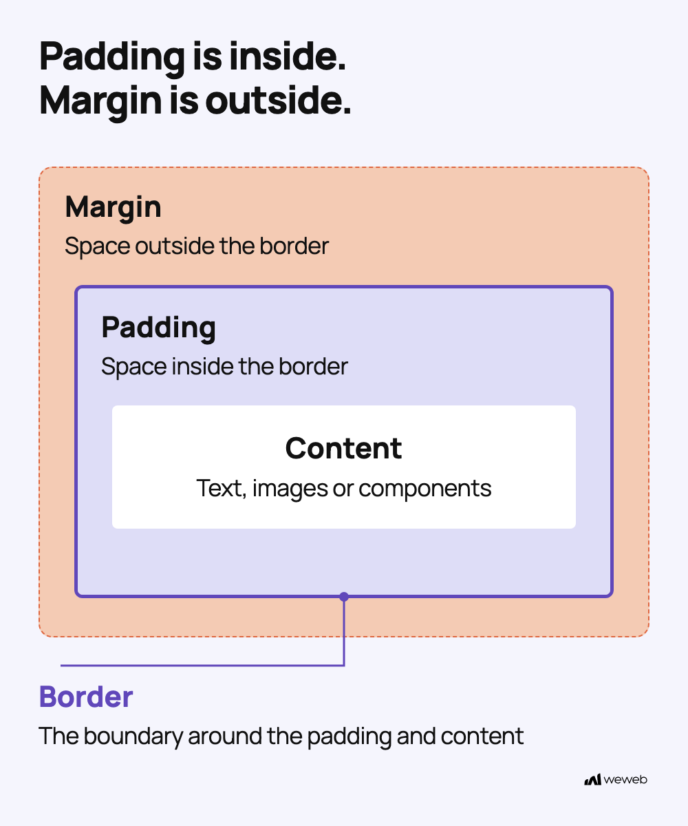
A good place to start is the CSS box model. Every element on a page is made up of its content, padding, border, and margin. Understanding how those layers affect an element's size and spacing gives you a clearer mental model for building layouts.
From there, it helps to understand layout concepts such as Flexbox, Grid, and responsive sizing. Visual development tools abstract the code, but the underlying browser rules remain the same.
💡 In WeWeb: These web concepts are exposed visually in the editor. For example, you can work directly with the box model to control an element's size, padding, border, and margin without writing CSS. Learn more about the box model in WeWeb.
2. Prioritize a Mobile-First Front-End Design
Mobile-first design means starting with the smallest practical screen and then progressively adapting the experience for larger ones.
It's not just a responsive technique. It's a prioritization strategy.
A smaller screen forces you to decide what matters most. There is less room for secondary controls, excessive navigation, or unnecessary information, so the core content and actions need to be clear.
Once that hierarchy works on a small screen, you can use the additional space available on tablets and desktops to enhance the experience rather than trying to squeeze a desktop interface into a phone.
A mobile-first approach can help you:
- Prioritize the most important content and actions.
- Reduce unnecessary interface complexity.
- Establish a clearer visual hierarchy.
- Create layouts that scale more naturally across screen sizes.
💡 In WeWeb: The layout system is mobile-first by default. Responsive breakpoints are built into components so you can start with smaller screens and progressively adapt the layout as more space becomes available.
3. Incorporate Responsive Web Design Techniques
If mobile-first determines where you start, responsive design determines how the interface adapts.
Responsive web design ensures that an interface remains usable across different screen sizes, devices, orientations, and content conditions.
Traditionally, responsive design relies on techniques such as fluid grids, flexible layouts, relative sizing, and CSS media queries. With visual development platforms like WeWeb, much of that implementation is abstracted, but the underlying design challenge remains the same:
Your interface needs to work between standard device sizes, not only at predefined desktop, tablet, and mobile breakpoints.
Check the Layout Between Breakpoints
Don't test only at desktop, tablet, and mobile presets. Resize the layout gradually and check that:
- Long names, headings, labels, and form errors don't overlap surrounding content.
- Controls wrap or stack before their container becomes too narrow.
- Images and media resize appropriately.
- Navigation remains usable.
- Essential information stays visible.
- The reading order continues to make sense.
- Touch targets remain usable on smaller screens.
Use realistic content while testing. A card that works perfectly with "John Smith" may behave very differently with a much longer customer name.

💡 In WeWeb: The visual editor shows how your layout responds across breakpoints while you're building, making it easier to catch responsive issues before they reach production.
4. Create a Design System
As a product grows, one-off design decisions become harder to maintain.
If every new page introduces a slightly different color, spacing value, button style, or form pattern, inconsistencies build quickly. A design system turns repeated decisions into reusable rules.
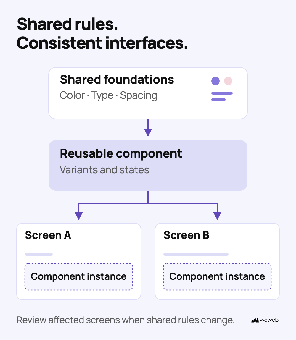
Start by defining shared foundations for:
- Colors.
- Typography.
- Spacing.
- Borders and radii.
- Layout conventions.
- Reusable components.
- Component and interaction states.
Ideally, those standards should be reflected both in your design tool and in the front end itself. For example, you might maintain the same foundations in Figma and your front-end framework or visual development platform.
A well-maintained design system helps with:
- Improved collaboration: Everyone works from the same design standards.
- Faster branding updates: Shared styles can be changed globally.
- Easier maintenance: Teams reuse established components and patterns instead of rebuilding them.
- Visual consistency: Pages and features feel like parts of the same product.
To make the system easier to maintain:
- Name shared values: Use design tokens for colors, spacing, and typography, such as
text-errorrather than an isolated color value. - Define component behavior: Document variants and states such as hover, focus, disabled, loading, success, and error.
- Reuse deliberately: Share components when their purpose and behavior repeat, not simply because they look similar.
- Manage changes: Check which screens will be affected by shared updates and document intentional exceptions.
A design system isn't something you create once. It should evolve alongside the product.
💡 In WeWeb: You can create shared libraries for fonts, colors, typography, styles, and reusable components, helping keep your application consistent as it grows. Learn how to use UI libraries in WeWeb.
If your design system already lives elsewhere, you can bring that context into your workflow too. Import variables, styles, and components directly from Figma, or connect your coding agent to WeWeb MCP and your design tool's MCP server.
5. Build With User Experience (UX) in Mind
A good front end isn't designed only around how a screen looks in its ideal state. It needs to support the complete experience of using the product.
User-Centered Design (UCD) helps keep those decisions focused on what users are actually trying to accomplish.
Core practices include:
- User Research: Understand user needs and behaviors through interviews, surveys, analytics, and usability testing.
- Prototyping: Test flows and assumptions before investing heavily in implementation.
- Consistency: Keep common interactions predictable across pages and features.
- Feedback and Iteration: Identify where users struggle, make improvements, and test again.
Design Every Interaction State
Don't design only the happy path.
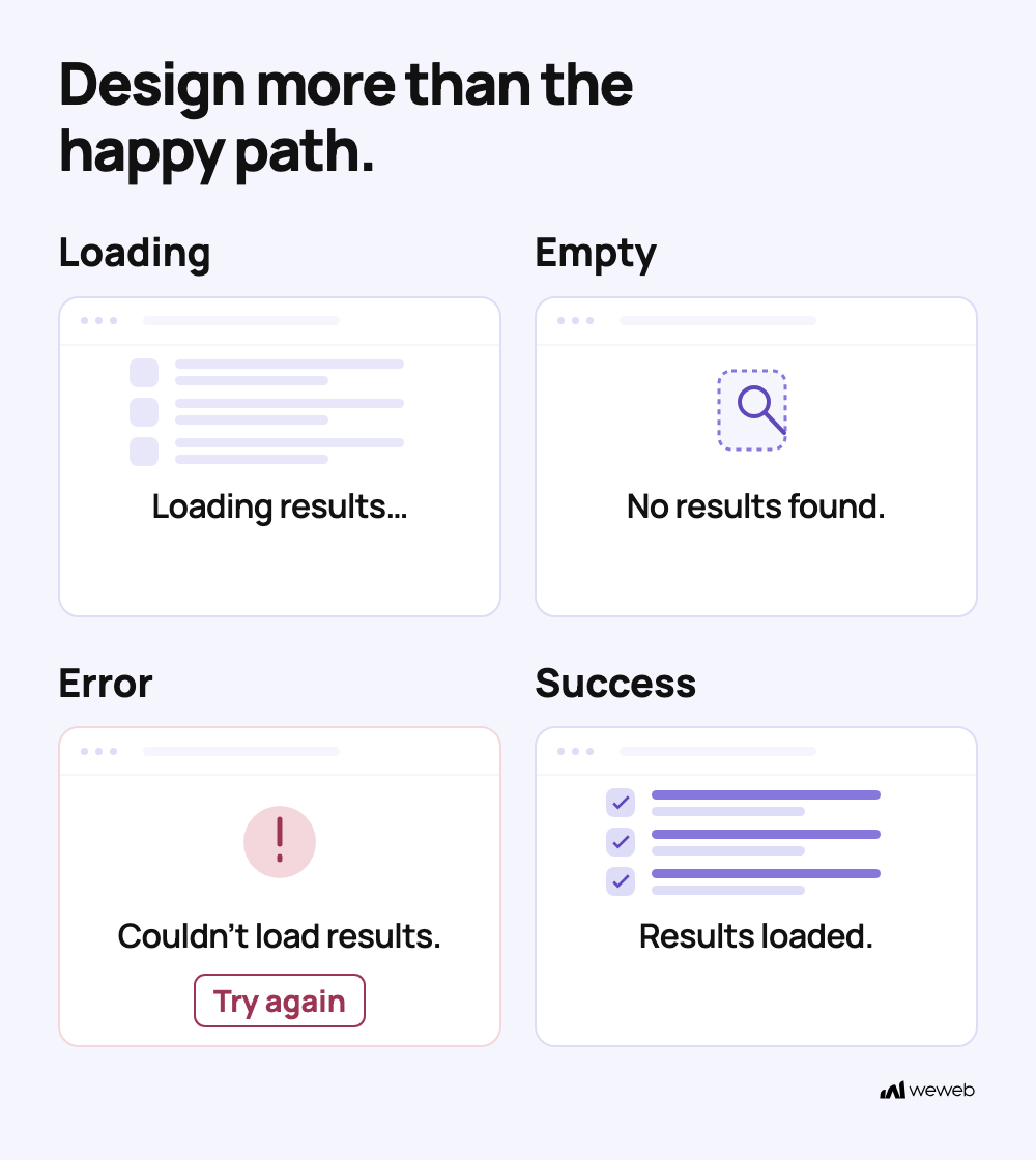
Consider what users see when:
- Content is loading.
- No results are available.
- A request fails.
- Form input is invalid.
- An action succeeds.
- A user doesn't have permission.
- Data takes longer than expected to load.
These states are part of the user experience, not edge cases to add at the end.
Accessibility Considerations
Accessibility should be part of the front-end design process from the beginning.
Start with these checks:
- ARIA: Prefer native HTML controls whenever possible. Add ARIA when extra accessibility information is needed; adding a role alone does not provide keyboard behavior.
- Alt Text: Provide meaningful alt text for informative images and empty alt text for purely decorative images.
- Semantic HTML: Use appropriate HTML elements to create a meaningful document structure.
- Keyboard Navigation: Ensure interactive elements can be reached and operated using a keyboard, with visible focus and no keyboard traps.
- Labels and Errors: Clearly associate inputs with labels and make validation messages understandable.
- Contrast: Make sure important text, controls, icons, and focus indicators remain distinguishable.
Then go beyond the checklist.
Increase the text size. Navigate a key workflow using only the keyboard. Complete an important task with a screen reader.
Automated accessibility tools can catch common problems, but a clean automated report alone does not establish WCAG conformance. Combine automated checks with manual testing.
Performance Optimization
Performance is also part of UX. Users experience every slow image, delayed request, and unexpected layout shift directly.
Useful optimization techniques include:
- Image Optimization: Resize and compress images appropriately.
- Layout Streamlining: Avoid rendering unnecessary elements at the same time.
- Data Processing Optimization: Be deliberate about how much data you load and when.
- Code Minification: Minify production HTML, CSS, and JavaScript where appropriate.
- Browser Caching: Cache suitable static assets to reduce repeated requests.
- Content Delivery Networks (CDNs): Distribute assets geographically to reduce latency.
Measure performance rather than relying on how fast the application feels on your own computer.
PageSpeed Insights can provide real-user data, when available, alongside controlled lab diagnostics. Google's Core Web Vitals provide measurable targets:
Assess all three at the 75th percentile of real visits, separately for mobile and desktop. A single lab test can help diagnose issues, but it doesn't represent the full experience of real users.
6. Debug and Test Your Front-End Design
A front end isn't finished when the ideal screen looks correct in the editor.
Different browsers, devices, screen sizes, content lengths, network conditions, and application states can expose problems that aren't obvious during the initial build.
Test both the interface and the tasks users need to complete.
For an important flow, test:
- A successful submission.
- Invalid or incomplete input.
- Loading states.
- Empty results.
- Failed requests.
- Long or unexpected content.
- Keyboard interaction.
- Different screen sizes.
- Different browsers.
- Real devices.
Once everything works in your editor or development environment, repeat the most important checks on the published application. Production environments and real devices can reveal issues that previews don't.
Testing should also continue after launch. New features, integrations, content, and components can introduce regressions into previously stable layouts and flows.
💡 In WeWeb: Built-in preview tools let you test layouts across device sizes before publishing. You can also use browser developer tools to inspect and debug the application directly.
What Is the Front-End Design Process?
The principles above should guide your design decisions throughout a project. But what does the actual front-end design process look like?
A typical process moves from understanding the problem to designing, building, testing, and maintaining the final experience:
- Requirements Gathering: Define the product goals, target users, functional requirements, pages, and features.
- Wireframing and Prototyping: Map the structure, user flows, and key interactions before committing to visual details.
- Design Mockups: Establish typography, colors, imagery, spacing, components, and other visual styles.
- Development: Turn the design into a working interface using a no-code tool like WeWeb or technologies such as HTML, CSS, and JavaScript.
- Testing and Debugging: Test interactions and compatibility across browsers, devices, and screen sizes.
- Optimization: Improve rendering, asset sizes, data loading, and overall front-end performance.
- User Testing: Validate the experience with real users and refine it based on their feedback.
- Deployment: Publish the application and configure its production environment.
- Maintenance: Monitor, update, and improve the front end as the product and user requirements evolve.
The process isn't always perfectly linear. Testing can reveal design problems, user feedback can send you back to prototyping, and a growing product can require changes to your design system.
The important thing is that the six principles above continue to guide those decisions at every stage.
Applying These Principles to AI-Generated Interfaces
AI can generate a front end in minutes, but speed doesn't replace good design decisions.
Without enough context, an AI agent can quickly create inconsistent spacing, duplicate components, missing interaction states, or responsive layouts that only work at one screen size.
The same six principles still apply. The difference is that some of the implementation work can now be delegated.
Start by giving your agent the context it needs, such as:
- Your typography, color, and spacing tokens.
- Existing components and their variants.
- Responsive layout rules.
- Accessibility requirements.
- Examples of approved screens.
- Conventions for loading, empty, error, and success states.
- Rules for when existing components should be reused.
You can also use agent skills built around established design practices, such as Refactoring UI, to give your agent reusable guidance on hierarchy, typography, spacing, color, responsiveness, and other UI decisions.
If you want those rules to persist across your project, document them in a file such as design.md and make that context available to your coding agent.
With WeWeb AI or MCP, you can bring that same design context into WeWeb rather than recreating your standards for every new screen.
You can even share this article with your agent and ask it to review a generated interface against these six principles.
Before shipping an AI-generated interface, review it the same way you would any other front end: test multiple screen sizes, use realistic content, check accessibility and interaction states, and confirm that it follows your existing components and design system.
AI can accelerate implementation. It doesn't replace design judgment.
Front-End Design FAQs
What is front-end design?
Front-end design is the process of designing the user-facing interface of a website or web application while considering how that interface will actually behave in the browser. It covers visual elements such as typography, colors, spacing, and components, as well as layout, responsive behavior, interaction states, accessibility, and usability.
Unlike purely visual design, front-end design takes implementation constraints into account so the interface continues to work across different screen sizes, browsers, content conditions, and user interactions.
What is the difference between front-end design, UI design, UX design, and front-end development?
Front-end design, UI design, UX design, and front-end development overlap, but they focus on different parts of creating a digital product.
- UI design focuses primarily on the interface's visual appearance, including typography, colors, spacing, hierarchy, components, and visual states.
- UX design focuses on the overall user experience, including user needs, journeys, information architecture, workflows, usability, research, and testing.
- Front-end design sits between design and implementation. It considers how the visual interface, responsive layout, components, interactions, and states should behave in a real browser.
- Front-end development turns those decisions into a working product using technologies such as HTML, CSS, JavaScript, frameworks, APIs, and application logic.
The responsibilities can overlap depending on the team. A front-end designer may prototype directly in the browser, while a front-end developer may also make significant UI and UX decisions.
What are the most important front-end design principles?
Good front-end design should be responsive, consistent, accessible, usable, performant, and maintainable. Key principles include starting with mobile-first layouts, designing for different screen sizes, creating reusable design systems and components, considering the complete user experience, optimizing performance, and testing real interactions across browsers and devices.
It is also important to design states beyond the ideal scenario, including loading, empty, error, disabled, validation, and success states.
What skills do you need for front-end design?
Front-end design combines visual design skills with an understanding of how interfaces work on the web. Useful skills include visual hierarchy, typography, spacing, responsive design, component and design-system thinking, accessibility, prototyping, usability testing, and interaction design.
You should also understand the fundamentals of HTML, CSS, and JavaScript. You don't necessarily need to write all of the code yourself, but knowing concepts such as the CSS box model, Flexbox, Grid, breakpoints, and browser behavior makes it easier to create designs that can be implemented reliably.
What tools are used for front-end design?
Front-end designers typically use a combination of interface design, visual development, testing, and browser tools. For example, Figma can be used for mockups and design systems, while a visual development platform such as WeWeb can turn designs into responsive web interfaces. Browser developer tools can help inspect layouts and debug issues, while tools such as PageSpeed Insights can help evaluate front-end performance.
AI tools can also accelerate interface creation, but generated designs should still be reviewed for responsiveness, accessibility, interaction states, consistency, and alignment with the product's design system.
Conclusion
Good front-end design isn't about making one screen look polished. It's about creating an interface that continues to work when the screen size changes, the content gets longer, the user encounters an error, or the product gains new features.
Start with solid web fundamentals. Prioritize smaller screens. Design for the space between breakpoints. Turn repeated decisions into a design system. Consider the full user experience, including accessibility and performance. Then test real tasks, states, browsers, and devices before you ship.
Do those things consistently, and you'll build front ends that don't just look better — they scale better too.
Want to apply these principles without writing CSS? See what WeWeb builds for you.

.avif)