


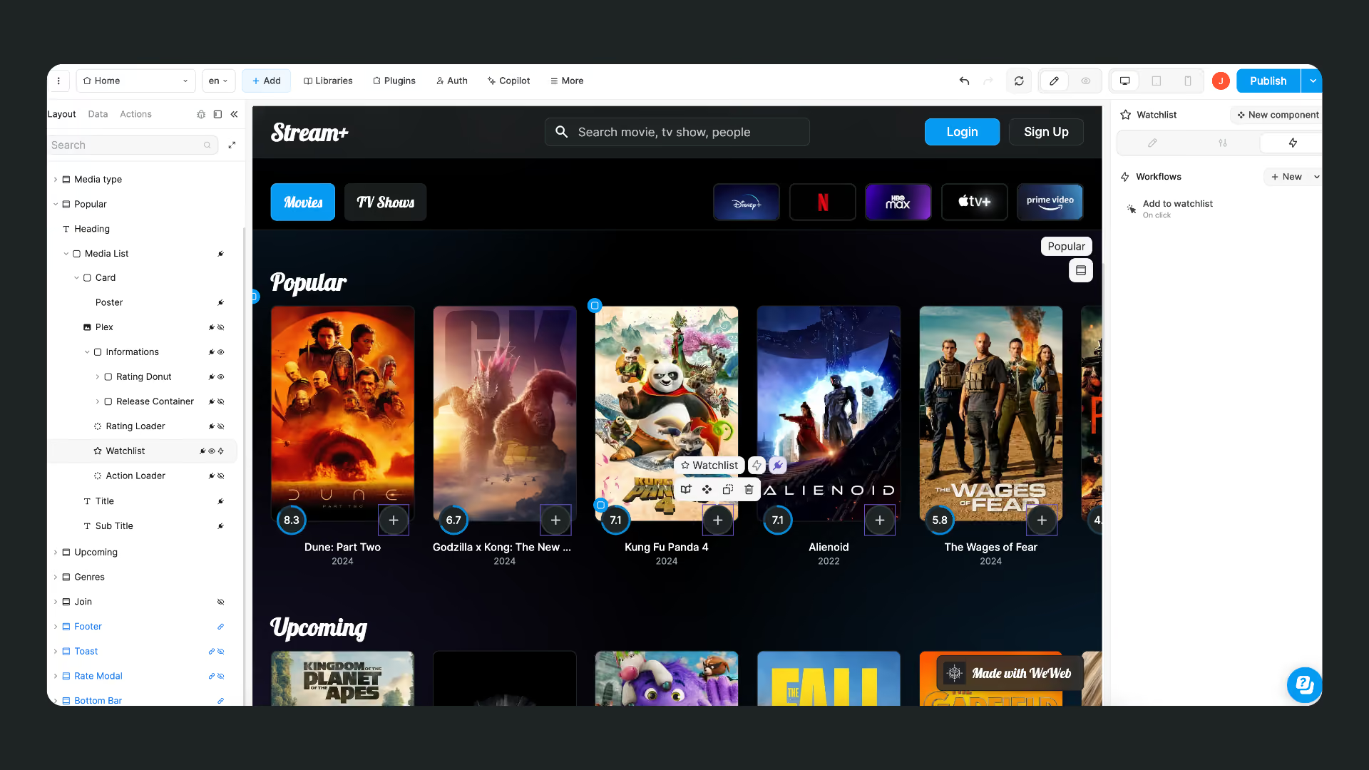
Good UI feels predictable. Users recognize the patterns, know what will happen next, and do not have to relearn the interface from screen to screen.
As Jakob Nielsen’s usability heuristics put it, interfaces should follow established conventions so users do not have to wonder whether different words, situations, or actions mean the same thing.
Predictability is easy on one screen. Keeping it across dozens of pages, components, and states is harder. These eight principles show you how to build those decisions into WeWeb so they scale with the app.
UI Principles Do Not Change in a No-Code Builder
The principles themselves are settled. Hierarchy, contrast, consistency, and clear feedback have shaped good interfaces for decades. Moving to no-code does not change the standard.
What tends to be missing, especially when there is no designer on the team, is knowing where those decisions should live so they stay consistent as the app grows.
In WeWeb, those decisions become reusable controls. Consistency lives in libraries and components. Feedback lives in element states. Accessibility shows up in focus states, themes, and alt text. Instead of fixing the same design problem screen by screen, you define the rule once and reuse it.
And you do not have to start from a blank canvas. You can bring a design in from Figma or start from a design created with Claude, then continue shaping the production interface in WeWeb.
That is the focus of this guide: not redefining good UI, but showing where to put those principles into practice so they scale with the app.
8 UI Design Principles for Web Apps
For each principle, we’ll cover what it means, what breaks when you ignore it, and where to put it into practice in WeWeb.
1. Simplicity
Simplicity is about how much you put on the screen, not how it is worded. Every extra button, column, and badge spends the user's attention before they reach the thing they came for.
The test is subtractive. For each screen, name the one action you want a user to take, then ask what would break if you removed everything that does not support it. Secondary actions can move behind a popup or onto a second page. Fewer elements per screen also means fewer states to design and maintain later.
In a builder, the control that keeps this honest is your library. When spacing, type sizes, and colors come from a defined set, adding a new variant takes deliberate effort, which is the point.
2. Clarity
Clarity is about comprehension: whether a user can tell what an element does before they interact with it.
Labels carry most of that load. "Save changes" tells someone what happens next. "Let's go" does not, and a clever call to action is a common place where a team trades a conversion for a bit of personality. The same rule covers navigation items, empty states, and error messages: describe the outcome, not the mechanism.
Buttons carry more of this than any other element, which is why button design has its own rules for labels, contrast, and touch targets.
3. Consistency
Consistency means the same thing looks and behaves the same way everywhere in the app. Consistent button styles and placement let people recognize what is interactive without relearning each page, and that recognition is most of what "polished" means to a user.
Three controls carry it in a visual builder:
- Multi-page sections put one section on several pages, so a change to one instance is reflected in the others.
- Components do the same for smaller units, i.e. a card, a nav bar, a filter row.
- A library holds the typographies, colors, spacings, classes, components, and templates your app draws from. That is where a design system lives.
4. Visual Hierarchy
Visual hierarchy is the order in which people read a screen. Size, weight, color, contrast, and position decide what the eye takes first, second, and never.
Nielsen Norman Group's five principles of visual design put scale, contrast, and proximity at the center of it: bigger reads as more important, higher contrast reads as more urgent, and elements placed close together read as related whether or not you meant them to be.
Hierarchy holds better when type sizes come from a set instead of being typed per element. The typographies in a library cover headers, labels, footnotes, and body, and every text element bound to one updates when the definition changes.
Dashboards are the hardest case, because everything on the screen claims to be important. Dashboard design is mostly the discipline of deciding what does not get top billing.
5. Feedback
Feedback is what the interface says back. Every action gets a response: the button shows it was pressed, the form says which field failed, the save confirms that it saved.
Silence is the failure mode. Someone who clicks submit and sees nothing clicks again, and now you have two records.
Style the states a button or input can be in, so an element does not look identical before and after a user touches it. Form validation covers the second half: the form container checks the input and exposes the collected data ready to send, so an invalid entry gets caught in the browser rather than in your database.
For anything that finishes out of view, a confirmation is worth the extra element. You manage reusable popups in one place and trigger them from any page, and you can react to the close event when the confirmation needs to lead somewhere.
6. Accessibility
Accessibility means the interface works for people using a keyboard, a screen reader, a small screen, or low vision. Over the life of an app, that is most of your users at some point.
Three controls do a lot of the work:
- Alt text on images: describe what the image communicates, not that it is an image.
- Light and dark themes: attach your library colors to a light theme and a dark theme and let users switch. Contrast then lives in the library instead of in one-off element styles.
- Focus states: button and input elements recognize a focus state when you add one, so keyboard users can see where they are. It is authored, not automatic, and it is the fastest accessibility win in this list.
7. User Control
User control is the idea that people decide how your app behaves for them, and the app remembers. Language, cookie consent, light or dark mode, whether they want the newsletter: none of these are your call to make on their behalf.
App languages cover the multilingual case, with a default to fall back to.
Variables saved in local storage cover browser-only preferences that should survive a reload.
Preferences that have to follow a user across devices need to be stored on a server. That is what WeWeb's native database and APIs are for: a form captures the input, a table stores it, and a view shapes it back into the interface. If you already run Supabase or Xano, point the same form at it instead.
Either way the pattern is the same, and a preferences table follows the same best practices for backend integration as the rest of your data.
8. Flexibility
Flexibility is one build working on any screen. A web app is delivered over the network rather than installed, so the same interface has to hold up on a laptop at a desk and on a phone on a slow connection.
WeWeb handles responsive design out of the box with three breakpoints, Desktop, Tablet, and Mobile. Styles inherit top down, so what you set on desktop carries to tablet and mobile until you override it, and you only maintain the differences.
Underneath that, CSS grid and flexible images let a layout reflow instead of scaling down into something unreadable. You can rearrange and resize buttons and images per breakpoint, which matters most for touch: a target sized for a mouse pointer is a frustration on a phone.
Principle to Control: A Quick Reference
Put the Principles to Work
Start with the screen your users see most.
Look for the decisions that repeat: typography, spacing, buttons, components, interaction states, and responsive behavior. Define those once, then reuse them instead of fixing each screen independently.
That is the point of applying UI principles inside a visual builder: not to make one screen look better, but to give the next fifty screens the same foundation.
---
Joyce's copy
UI (user interface) design is an aspect of frontend development that helps shape user interactions and perceptions.
Understanding UI design principles enables the creation of seamless, user-centric interfaces that enhance usability and eliminate frustration.
With intuitive layouts, straightforward navigation, and visually appealing elements, UI design fosters engagement and drives conversions.
In this article, you’ll learn about 6 essential UI design principles and how WeWeb can help you design beautiful web-apps your visitors will love.
6 Key UI Design Principles to Use When Building Web-Apps
From intuitive navigation to visual hierarchy, the following 6 principles enhance user experience and engagement. Understanding and implementing these principles will increase the effectiveness and impact of your web-app design.
#1: Consistency
Consistency in UI design is the glue that holds the user experience together. It ensures that design elements, layouts, and interactions maintain uniformity throughout the interface and create a seamless user journey.
Consistent patterns and styles help users easily predict how elements will behave, reducing confusion and increasing efficiency.
Consistent button styles and placement across a website, for example, allow users to quickly identify interactive aspects without having to relearn their function on each page.
WeWeb's interface embodies this principle by offering features like:
- Multi-page sections put one section on several pages, so a change to one instance is reflected in the others.
- Components do the same for smaller units, i.e. a card, a nav bar, a filter row.
- UI libraries olds the typographies, colors, spacings, classes, components, and templates your app draws from. That is where a design system lives
linked sections, UI libraries, and components:

With these tools, users can effortlessly replicate successful design elements and layouts across multiple pages, maintaining a cohesive aesthetic and reinforcing user familiarity.
This consistency not only enhances usability but also strengthens brand identity and trustworthiness.
#2: Clarity
Clarity in UI design ensures that users can easily understand and navigate interface components. It involves making design elements clear and easily understandable so users quickly grasp their purpose and functionality.
For instance, you should use descriptive labels for buttons and navigation items to convey their intended actions clearly.
While you might be tempted to write a fun call-to-action on a button, it can unintentionally create confusion and prevent users from clicking on it and moving forward in their journey:

WeWeb's interface supports clarity across page creation by providing intuitive design tools and options, including a wide-range of customizable templates and pre-designed components:
.png)
#3: Accessibility
Accessibility is about making digital experiences inclusive and usable for everyone, regardless of their abilities or needs.
This principle emphasizes the importance of considering diverse user perspectives and implementing features that accommodate various accessibility requirements, such as providing options for adjusting text size, color contrast, and keyboard navigation.
WeWeb provides the tools you need to build accessible web-apps, including but not limited to:
- Easy alt-text inserts for images
- Straightforward implementation of multiple color themes
- Input elements with native focus state that support keyboard navigation
#4: Visual Hierarchy
Visual hierarchy guides users' attention by organizing elements based on their importance and relationships.
Designers prioritize content through variations in size, color, contrast, and placement, making it easier for users to digest information.
Clear hierarchies lead users through the interface, directing them towards key actions or information.
For example, headlines are typically larger and bolder than body text, drawing attention first, followed by supporting visuals or interactive elements:

By guiding users intuitively through the interface and helping them focus on what matters most, effective use of visual hierarchy:
- improves readability,
- speeds up task completion, and
- enhances the overall user experience.
WeWeb helps developers design UIs with strong visual hierarchy by providing templates with built-in hierarchies and allowing users to arrange and size elements in a way that emphasizes key content and guides users through the app step-by-step.
#5: User Control
User controls is the notion that users can control and personalize their experience of your digital products.
In UI design, it emphasizes empowering users to navigate, manipulate, and customize the interface according to their preferences.
For instance, interfaces can allow users to choose, change and save personal preferences, including but not limited to:
- What language they want to display.
- What kind of cookies they consent to.
- Their preference for a light or dark mode.
- Whether they want to receive a newsletter or not.
WeWeb's interface facilitates user control through features like:
- Multi-language support.
- User forms to capture user input.
- Variables that you can save in local storage.
- Customizable pop-ups with easy closure options.
With WeWeb, you can build custom user interfaces that convey critical information or capture user input while also allowing users to control their browsing experience.
#6: Flexibility
Flexibility emphasizes creating designs that adapt seamlessly across various devices and screen sizes.
By employing responsive design techniques, such as fluid grids and flexible images, designers enable content to adjust dynamically to different viewport sizes.
This approach guarantees that users can access and interact with the interface comfortably, whether using a desktop computer, tablet, or smartphone:

Additionally, prioritizing touch-friendly interactions and optimizing for both portrait and landscape orientations further enhances usability across diverse devices.
Elements like buttons and images can be rearranged and resized to accommodate different screen resolutions and orientations.
Designing Great UIs With WeWeb
WeWeb empowers users to create stunning and functional websites without the need for extensive coding expertise.
Its easy-to-use drag-and-drop interface lets users seamlessly design and customize every aspect of their website, from layout to navigation to color schemes:
One key feature of WeWeb is its extensive library of pre-designed components that are fully customizable and give users a solid foundation for building their websites.
With WeWeb, users can access a plethora of professionally designed elements, saving time and effort while achieving a polished UI:
WeWeb offers users the tools and flexibility to create unique yet user-friendly experiences for their audiences that stand out in a crowded marketplace:
Whether you're a seasoned designer or just starting out, WeWeb provides the resources and support you need to turn your vision into reality.
Tips & Tricks for A Better UI With WeWeb
Implementing these UI design principles in a WeWeb app is seamless and accessible to developers of all skill levels, both traditional coders and less experienced no-coders.
Indeed, the platform offers various integrations and native features that simplify and streamline the building process.
For instance, WeWeb users can leverage integrations like Stripe for a fast and secure checkout process, enhancing usability and convenience for customers.
Additionally, WeWeb provides access to a Starter UI kit that includes a collection of professionally designed components and layouts that adhere to UI design best practices.
.png)
Overall, WeWeb empowers developers to effectively incorporate UI principles into their web-app designs, resulting in intuitive and impactful user experiences that drive engagement and satisfaction.
Mastering UI design principles is essential for creating intuitive and impactful user experiences in today's digital landscape.
With WeWeb, designing user-friendly web-apps that adhere to these principles has never been easier.
Ready to build a gorgeous UI that enhances users' experiences? Try WeWeb for free today!
