Build dashboards, admin panels, and reporting views without hand-coding charts.
Display bar, line, area, pie, doughnut, radar, polar area, and more.
Connect Chart.js datasets to any data source configured in WeWeb: REST APIs, Xano, Supabase, Airtable, or custom backends.
Visualize KPIs from your database or APIs in real time.
Update charts automatically when users change filters, date ranges, or other inputs.
Control styling and formatting directly from the WeWeb Editor.
What WeWeb supports natively
Category
Feature
What it does
Setup
Charts
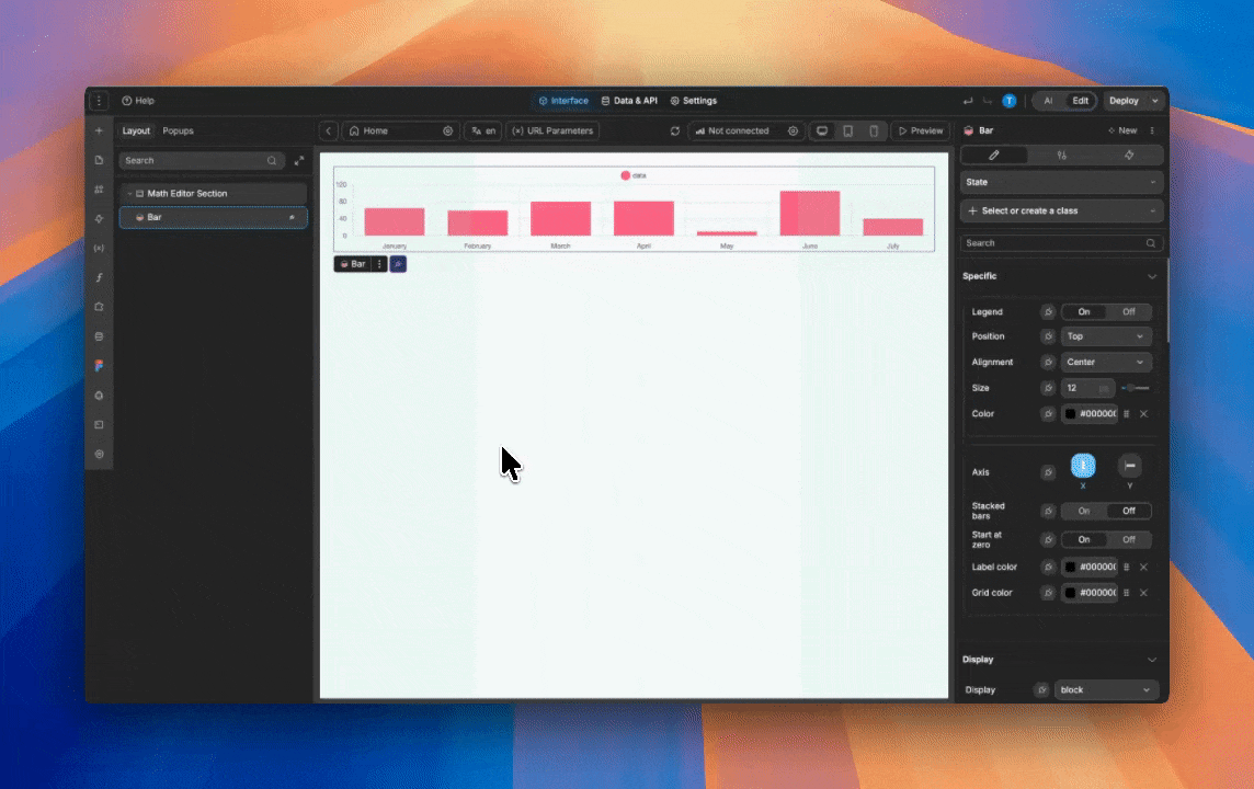
Add chart elements in the Add panel.
UI elements
Prebuilt chart elements
Provides out-of-the-box elements for common chart types (e.g., line, bar, pie, doughnut) that can be dragged and dropped.
Modes
Guided
Lets you bind a single array of objects and visually pick which fields map to the X-axis, Y-axis, and group/series.
Modes
Advanced
Exposes separate bindings for Labels, Datasets, and Options so you can paste or generate full Chart.js configuration objects for maximum customization.
Data binding
Bind to collections and variables
Allows charts to consume data from WeWeb collections, API responses, or variables.
Interactivity
Click/hover events (extension-level)
Use chart interactions like clicking a segment or point to trigger workflows or pass selected data.
Extensibility
Use with WeWeb native or external backends
Works with backends like WeWeb native, Xano or Supabase: fetch data via workflows and pass it into Labels/Datasets/Options in Advanced mode.
Why use WeWeb with Chart.js
WeWeb handles the frontend logic, state and data connections while Chart.js focuses on the visualization layer so that you can:
Fetch data and visualize it in the WeWeb Editor.
Tie chart updates to filters, tabs, search inputs, and user permissions using WeWeb’s bindings and workflows.
Create sections or components with configured Chart.js charts and reuse them across pages, apps, or clients.
Use the same Chart.js components whether your data lives in Xano, Supabase, Airtable, or a custom API.
Perfect for:
Client reporting dashboards:connect Chart.js charts to client-specific data and share branded dashboards that visualize performance, revenue, or usage trends.
Internal analytics tools:build internal tools for ops, finance, or support teams where they can filter data and instantly see updated charts.
Customer portals:add charts to portals so customers can track their activity, billing, or usage metrics over time.
SaaS admin panels: include KPI overviews, cohort charts, and retention views directly in your admin panel or product analytics pages.
Adding charts with WeWeb
Adding charts is straightforward:
Add a chart element to the page: open the Add panel and drag your Chart.js-based chart component onto the page
Bind chart data to your source:select the chart component and bind the labels to your formatted label array and the dataset(s) to the numeric value arrays
Configure chart options: choose the chart type and set titles, tooltips, axis labels, and legend options
Wire up filters and interactions: add dropdowns, date pickers, or buttons to your page, and use workflows to refetch or transform data when a filter changes
Best practices
Limit data points for readability: large datasets can make charts slow and hard to read. Aggregate data (for example, daily to weekly) where it makes sense.
Keep chart types consistent: use similar chart types across a dashboard to make comparisons easier for users.
Name datasets clearly: use clear labels for series (for example, “Actual MRR” vs. “Target MRR”) to remove ambiguity.
Use workflows for heavy processing: offload complex calculations or aggregations to your backend or to workflows before sending data to charts.
Test on different devices: Chart.js is responsive, but always preview and adjust your layout for different screen sizes in the Editor.
Possible limitations
Rendering thousands of points in a browser can affect performance. Consider summarizing or paginating data before sending it to the chart.
If you need very advanced Chart.js plugins or custom drawing logic, you may need additional configuration or custom components in your project.
FAQs
1. What is the difference between Guided and Advanced modes?
Guided mode expects a single array of objects and lets you map fields to X‑axis, Y‑axis, and group/series with a visual interface. Advanced mode lets you bind separate Labels, Datasets, and Options objects.
2. When should I use Guided mode instead of Advanced mode?
Guided mode is best when you want to quickly visualize simple datasets with minimal configuration, such as a basic time series or grouped bar chart. If you hit design limits or need detailed control over axes, legends, stacking, or mixed chart types, you can switch to Advanced mode.
3. How do I feed data from my backend (e.g., Xano or Supabase) into charts?
Fetch data into a collection or variable via workflows, then bind that array directly in Guided mode or transform it with a JavaScript formula into Labels and Datasets for Advanced mode. The key is to structure the data as Chart.js expects: a single array of objects for Guided, or synchronized arrays/objects for Advanced mode.
4. How is chart styling handled in Guided vs Advanced modes?
In Guided mode, most styling (colors, fonts, spacing) is controlled from the Style tab like any other element, with some basic dataset color controls in settings. In Advanced mode, visual configuration lives inside the Datasets and Options objects, where you can define legend behavior, aspect ratio, line tension, and other Chart.js options.
5. Can I build mixed charts like line + bar or stacked bar charts?
Yes! For example, you can create mixed bar/line charts and stacked bar charts in Advanced mode by configuring Datasets with different types and using Chart.js stacking options.
6. What are the main limitations of the native Charts plugin, and can I extend it?
Out of the box, WeWeb supports a subset of Chart.js options and chart types. Some advanced types and plugins (like annotation or custom labels) require manual configuration or custom code. To extend behavior, you can craft custom Options/Datasets objects or wire additional options via custom JavaScript blocks.