This release brings you better access to your Datagrid data and more flexibility in how you style each header.
Before, the Datagrid only exposed the data visible on the screen, which made it difficult to build advanced logic, especially around filters, sorting, or pagination.
Now, you can access the full dataset behind the Datagrid, before and after user interactions:
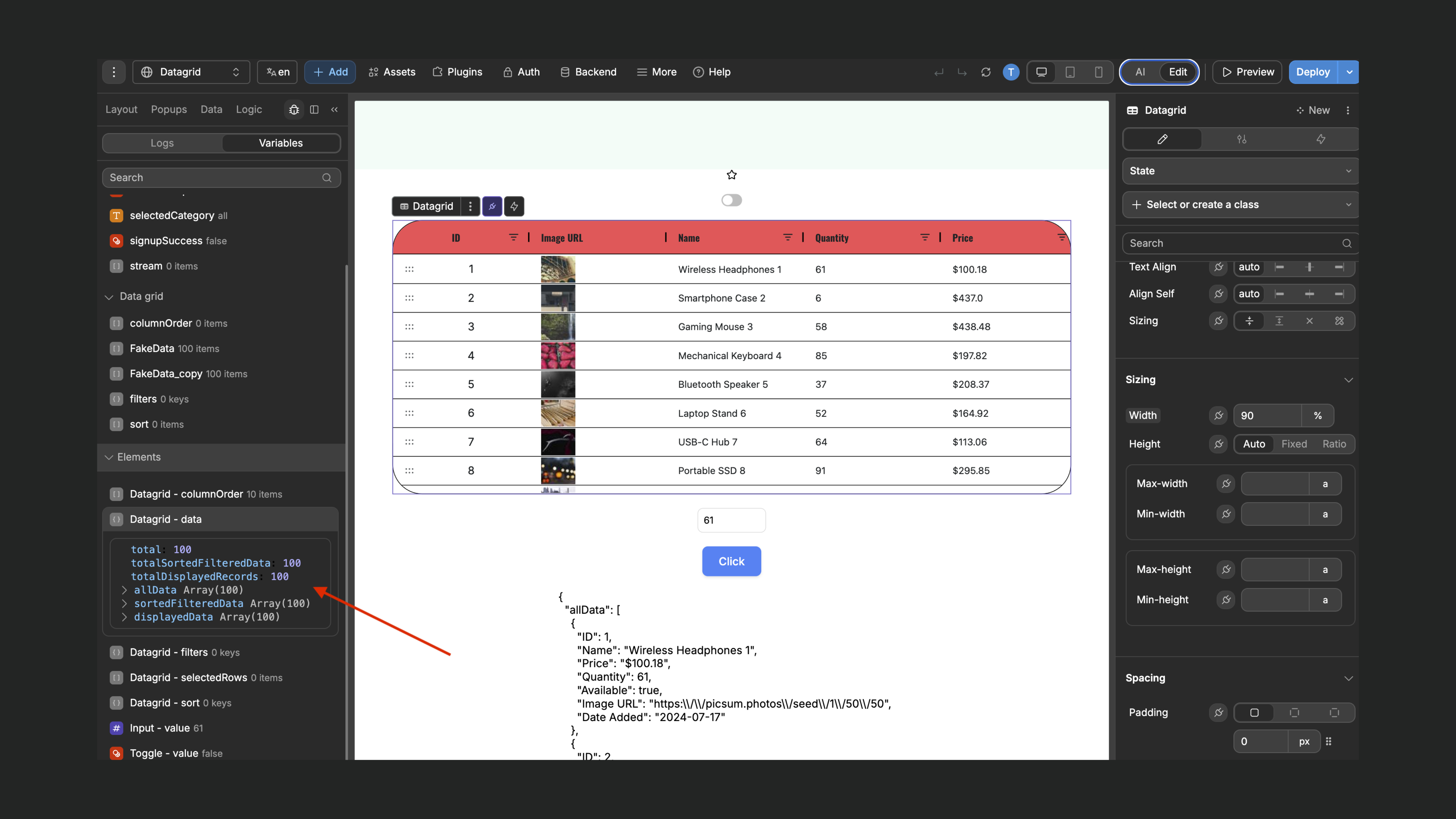
You have access to:
• allData: the full list of records powering the Datagrid
• total: the total number of records in allData
• sortedFilteredData: the dataset after filters and sorts are applied
• totalSortedFilteredData: the number of records after filters and sorts
• perPageTotal: the maximum number of records shown per page
• totalPages: the total number of pages when pagination is enabled
• displayedData: the portion of sortedFilteredData visible on the current page
• totalDisplayedRecords: the count of displayed records after all filters, sorts, and pagination
This makes it easier to:
• Display counts or summaries that reflect the user’s current view
• Build logic or workflows based on the full dataset or just the filtered view
• Create custom pagination or sorting experiences
Check out our docs to learn more
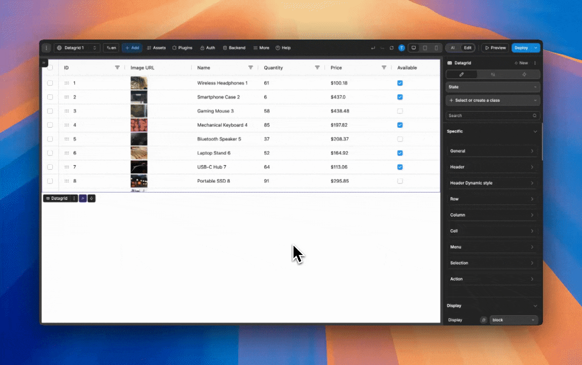
Before, every Datagrid header had to share the same styling because the header didn’t have access to information about its column.
With this update, you can style headers independently for each column:
• Style each header individually
• Highlight important columns
• Apply conditional styling (e.g., style all date columns differently)
• Create more readable and structured Datagrids
Check out our docs to learn more
That’s all for this release! As always, let us know what you think 🙂
